The CSS Interview Question That Is Harder Than It Looks

When interviewing candidates over the past 5 years, I created a CSS only interview question that is tricky, and tests for more than just programming competence.

The task

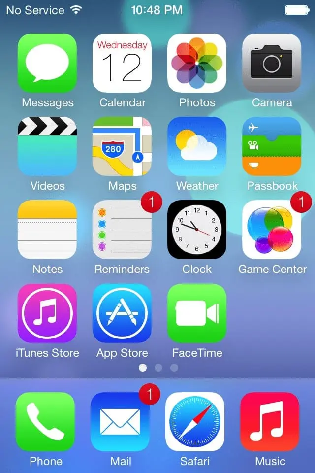
I provide the markup, below, and you style it to be a basic iPhone 4 layout. To make it reasonable, I want the flat layout of iOS 7. And you can ignore things like the status bar at the top, and all of the images. This is just a dumb prototype-like proof of concept. Make up the spacing values, I don’t care.

All I want is square apps that flow from left to right, wrapping into the next row, all spaced evenly. The space on the sides and top of the screen must match the space between the apps. Save the "app name" area for last. Almost no one gets that far anyway. Try to set up the dock as well.

Screen capture of iPhone 4 with iOS 7 installed

I say up front, "You don’t need to look up anything. I can answer any question you will need to solve this. I am your Google. Ask me anything."

"Oh, and I want it to be fully responsive. Everything should resize proportionally based on the width of the screen."

"...and no VWs."

The markup

<phone>
  <main>
    <app><name>name</name></app>
    <app><name>name</name></app>
    <app><name>name</name></app>
    <app><name>name</name></app>
    <app><name>name</name></app>
    <app><name>name</name></app>
    <app><name>name</name></app>
    <app><name>name</name></app>
    <app><name>name</name></app>
  </main>
  <dock>
    <app><name>name</name></app>
    <app><name>name</name></app>
    <app><name>name</name></app>
    <app><name>name</name></app>
  </dock>
</phone>

What happens

At first glance, this is not much of a test at all. Almost every person I have interviewed smiled and jumped into coding up the styles. Then when they think they’re in a good spot, they refresh. And the screen is blank.

Panic sets in. I can see the thoughts rush through their head: "What the heck is going on?! What did I do wrong?!"

The demeanor of the interview changes. Now, I am testing their debugging skills. I can see how they handle stress, frustration, and pressure. They open up the browser’s dev console’s inspector, see what the browser picked up, and realize that their code is indeed being rendered. Then they start trying things in the dev console.

Excellent! I can see that this person at least knows about the dev console. And they are familiar enough to use it effectively. All good signs that this person is not completely lost. They must have spent some time in web development. And now I can see the different styles that they are trying to apply. I am learning about the breadth of their CSS knowledge, and how far outside the box that they think. This is exactly what I want to assess in this interview.

What I really want to see is the behavior. Do they ask questions? It’s fine if they do that; it will not hurt their assessment. Do they get angry? A good interviewee will talk through their thought process; there is only so much one can glean from watching another person silently program.

I have had individuals get frustrated and completely shut up. Not good.

I have had individuals get angry and complain about how they would never have set up the HTML this way, and that’s why they’re having trouble. Maybe true, but I don’t care. This is the challenge. To get the right answer, you don’t change the question.

I have had people jump into the code and change the HTML without asking. Of course, I remind them that they don’t need to change any of the HTML, and they inform me that it will be better this way. ...Ok? Good luck, I guess? My notes: "Interviewee didn’t solve a single code challenge, but they did create their own challenges and solved those!"

I have only ever had one person solve this without help. I was impressed and had to add on other requirements to fill the time. They knows who they are, and I hope they read this someday.

The best outcome is that they start asking questions. As they get answers, they hopefully start applying that knowledge in the right place. And once they have that knowledge, hopefully they retain it, and use it later in the exercise.
The Reveal

I doesn’t really care if they finish completely, but would like for them to get a certain amount of the way through the exercise. I usually finish the challenge for them, and explain how the different pieces of the solution work, pointing out where they were close, and why it was not technically correct.

I have had people argue with me. "[Their] solution was correct, and it would have worked fine!" I once spent 20 minutes after the interview had ended explaining to a person why my solution would have been mathematically incorrect, causing the layout to be a few fractions of a pixel out of alignment. I eventually understood the DOM parent/child relationship that was causing my % math to deteriorate. That was an attitude I wasn’t pleased with.

I have had people who said that it was a dumb exercise, and was completely unrealistic to most web development situations. ¯_(ツ)_/¯

And I have had people say, "That was totally fascinating. I didn’t know about [thing], and I will never forget it now!" This is the best attitude, obviously. I am happy to see their excitement at learning; and their lack of ego, which allows for them to learn without resenting me.

As a testament to my claim that "he doesn’t really care if they finish completely", most of the people on my team right now have had this interview question, and none of them finished without help. The guy that did solve it was hired, but has since moved on to other teams.

* * *

As far as I have been able to figure out, there’s only one way to solve this with the rules set above. But below, there are 4 different solutions: the first, is the "correct" solution, and the following solutions support newer CSS rules, and lose older browser support.

* * *

Shared across all examples

Because, we are used to standard HTML, that gets default browser styles, we forget that some styles need to be set. Using custom elements like <phone>, <app>, <dock>, etc is like naming a bunch of <span> elements. They are inline, have no padding/margin/width/height. We have to set those things.

Similarly, we are used to CSS resets. You set up one thing, one time, to fix a bug. Then you forget that it ever happened, and how to fix it. We have to fix that too 😅. Usually, just the <body> (sometimes the <html> element) have default padding or margins set. We need to reset that.

This step, is why most people see a blank screen on the first try.

html, body {
  margin: 0;
  padding: 0;
  color: white;
  font-size: 100%;
  font-family: sans-serif;
}
phone, main, dock, app, name {
  display: block;
  box-sizing: border-box;
}

Float with no VWs

The main rub here is how to make squares, with even spacing that scales. Sometimes people start setting up rems or ems in concert with media queries to change the top level font-size. Clever, but no. No media queries are needed. That leaves us to use % units, right? But how do you make a square using percents? width in percents is based on the width of the element’s parent, and height in percents is based on the height of the element’s parent. For many many screen sizes, these won’t be squares... right? What’s missing?

Here’s the secret. Most people don’t know that padding, border, and margin definitions that use percent units are based on the parents width. So, if you set a top or bottom padding with percent values, that will be rendered based on the width of the parent. You'll be getting vertical adjustments based on horizontal values.

In the examples below, apps will be 20% wide, with 4% gaps between them. 4 apps with 3 gaps, and the 2 sides. That adds up to 100%.

/* The phone screen container */
phone {
  overflow: hidden;
  position: relative;
  width: 100%;
  padding-top: 128%; /* 5 apps tall, 7 gap values */
  /* height is 0. This is crucial. */
}

/* The top portion of the phone */
main {
  position: absolute;
  top: 0;
  left: 0;
  width: 100%;
}

/* The dock at the bottom of the screen */
dock {
  width: 100%;

  /* Same space at the bottom as on the sides and between the apps */
  padding-bottom: 4%;

  /* lock the dock to the bottom of the screen */
  position: absolute;
  bottom: 0;
  left: 0;
}

/* Each app square. This is the magic. */
app {
  /* Floating handles the automatic wrapping,
     and the float aligns the elements
     left to right, top to bottom */
  float: left;

  /* Arbitrary, but keeps the rounding consistent.
     Using % makes it scale responsively */
  border-radius: 20%;

  /* To make a square, make the following values identical. */
  width: 20%;
  padding-top: 20%;

  height: 0; /* crucial */

  /* Set the top and left margins to the gap value.
     Other apps will stack up behind nicely */
  margin-left: 4%;
  margin-top: 4%;
}

Float with VWs

Viewport units are awesome, and they make this a lot easier. Basically, do the same stuff as the first example, but set everything using vw units. Set a height instead of padding-top.

You don’t have to, but you can use 2vw margins/padding (all the way around the elements) to maintain the 4vw gap, and make the DOM look more symmetrical when using the inspector.

/* The phone screen container */
phone {
  overflow: hidden;
  width: 100vw;
  height: 128vw;
}

/* The top portion of the phone */
main {
  width: 100vw;
  padding: 2vw;

  /* I set a height this time
     since it’s easy with vw units */
  height: 100vw;
}

/* The dock at the bottom of the screen */
dock {
  /* No need to position this absolutely
     since the main element has a height set */
  width: 100vw;
  padding: 2vw;
  height: 28vw; /* 1 app, 2 gaps */
}

/* Each app square. */
app {
  float: left;

  border-radius: 20%; /* I left this as a percent */

  width: 20vw;
  height: 20vw;

  margin: 2vw;
}

Flexbox

Flexbox is pretty great in a lot of cases, but it’s not much better than the others so far. The code below is applied after extending the code from the "Float with VWs" example, above.

The main improvement is, the dock spacing works like iOS, when you have fewer than 4 apps in the dock. I went ahead and added the close button styles, app dancing animation and javascript in the proof of concept that lets you delete apps to see it.

/* The phone screen container */
phone {
  overflow: hidden;
  width: 100vw;
  height: 128vw;
}

/* Apply Flexbox rules to
   the top portion of the phone &
   the dock at the bottom of the screen */
main, dock {
  width: 100vw;
  display: flex;
  padding: 2vw;
  justify-content: flex-start;
  flex-wrap: wrap;
  align-items: flex-start;
  align-content: flex-start;
}

/* The top portion of the phone */
main {
  height: 100vw;
}

/* The dock at the bottom of the screen */
dock {
  height: 28vw;
  justify-content: space-evenly;
}

/* Each app square. */
app {
  border-radius: 20%;
  width: 20vw;
  height: 20vw;
  margin: 2vw;
}

CSS Grid

CSS Grid is a powerful new* set of specs that make work like this a lot easier. We just need to describe the grid spacing, and set a couple of heights. Then the Grid just handles everything.

/* The phone screen container */
phone {
  /* Nothing needed here. */
}

/* The top portion of the phone */
main {
  /* ✨ magic ✨ */
  display: grid;

  /* 4 columns, 4 rows */
  grid-template-columns: repeat(4, 1fr);
  grid-template-rows: repeat(4, 1fr);

  height: 100vw;
  width: 100vw;
  grid-gap: 4vw; /* Space between apps */
  padding: 4vw; /* Space around the edges */
}

/* The dock at the bottom of the screen */
dock {
  /* ✨ magic ✨ */
  display: grid;

  /* 4 columns */
  grid-template-columns: repeat(4, 1fr);

  height: 28vw;
  width: 100vw;
  grid-gap: 4vw; /* Space between apps */
  padding: 4vw; /* Space around the edges */
}

/* Each app square. */
app {
  border-radius: 20%;
  /* We don’t need to set the height or width.
     The grid handles it */
}

Conclusion

Hopefully, the examples above were interesting and taught you some nifty tricks about CSS. Feel free to use this as a technical interview question; but also keep in mind that the solution is on the internet. 😁

Try to keep these gotchas in mind when you work on future projects. It could save you a headache.